Hi everyone,
I am currently working on estimating the Non-Accelerating Inflation Rate of Unemployment (NAIRU) for Canada, using the unified approach proposed by Crump et al. (2019)
A-Unified-Approach-to-Measuring-u.pdf .pdf (2.2 MB)
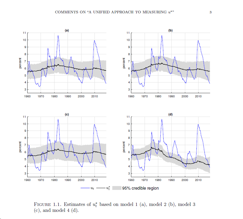
. As part of my analysis, I aim to compare the difference between four specifications, similar to those used by Primiceri (2019) in page 3, Figure 1.1.
Primiceri2019.pdf (377.9 KB)
To effectively present my findings, I’d like to plot the NAIRU estimates along with confidence intervals with shad in background. Primiceri (2019) utilizes a particular function for this purpose
shadedplot.m (2.0 KB)
, which I’m struggling to replicate and adapt to my own code.
I would greatly appreciate it if anyone could suggest an alternative method or guide me through the process of creating a shaded confidence interval plot. If it’s helpful, I can provide the specifications I’m using or any other relevant details upon request.
Thank you in advance for your time and assistance.
Best regards,
I am not sure I understand the problem. You need to use an area plot for the shaded are and a line plot for the line. What is the exact issue you experience when you try that?
Good afternoon dear Prof. Pfeifer,
I do thank you for your reply.
I need to use an area plot like in Primiceri (2019). See the graph below.
I could not use the function created by Primiceri as uploaded in my previous message, I find it too complex for a beginner as me in coding in Matlab/Dynare.
Good afternoon, dear Prof. Pfeifer,
Thank you very much for your prompt response.
I am aiming to produce an area plot similar to the one in Primiceri (2019) :
, and I have attempted to use the function provided by Primiceri that I referenced in my previous message. However, I found the complexity of the code to be a bit overwhelming as I am still a beginner in Matlab/Dynare coding.
Could you possibly suggest a more beginner-friendly method or tool that could assist me in generating such a graph for my own estimates? Any guidance or alternative recommendations you could provide would be greatly appreciated.
Warm regards,
DDD
The simplest example is:
x=0:10;
top=10:20;
bottom=5:15;
y1=7.5:17.5;

y = [bottom; (top-bottom)]';
ha = area(x, y);
set(ha(1), 'FaceColor', 'none') % this makes the bottom area invisible
set(ha(2), 'FaceColor', [0.5 0.5 1])
set(ha, 'LineStyle', 'none')
% plot the line edges
hold on
hb = plot(x, y1, 'LineWidth', 1,'Color',[1 0.5 0.5]);

% put the grid on top of the colored area
set(gca, 'Layer', 'top')
grid on