Dear Prof Johannes,
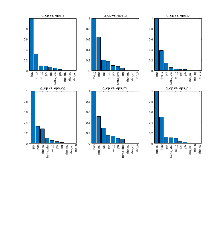
Could you please help me explain the plot generated from dynare_sensitivity command as attached. I read your guide about graphics outputs but cannot classify it into ones you mention.
Should I understand for example in the attached plot for g_cp vs eps_a: parameter hab has the strongest effect while phi is very weak w.r.t g_cp in response to eps_a!? Is it right?
Many thanks!
Best,