I am making a medium-scale model of a small open economy. I have read a little about the interpretation of mode graphs.
[To facilitate the reader, I will place the parameters in a vector and at the end after the colon I will place the figure number where the mode graphics are located.]
The questions are:
1.- Do the graphs of the parameters (SE_estarhat, SE_varepsilonhat: 1), (aleph: 2), (psi: 3), (upsilon: 4) not represent a good estimate of the mode, given that they are far from the maximum of the posterior? I understand that we have to observe the Y scale of the graph, and comparing it with others they look close only that it has some zoom.
2.- In case they are not well estimated, what is the best way to correct this? Changing the priors, the initial values, or the mode finder?
1.fig (190.7 KB) 2.fig (190.2 KB) 3.fig (190.3 KB) 4.fig (190.2 KB) 5.fig (42.0 KB)
There is indeed something weird going on. It’s a problem when the detected mode is not at the peak of the posterior. It suggests that mode-finding did not converge. One thing to do is use a different mode-finder. However, the parameters with the small range on the x-axis in the first graph suggest something odd is going on, e.g. you are running into a prior bound. That may explain the issues.
Thanks for your reply.
I didn’t understand what he meant by “you are running into a prior bound”. In this case, in the first image the parameters that have a small range on the x axis are SE_estarhat and SE_varepsilonhat, for both I assumed a prior with the following characteristics: inv_gamma, 1.000, inf. I suppose what you suggest is that I have to do is reduce the mean to a smaller value, is this correct?
No, I was suggesting to use prior_trunc=0 if necessary.
Thank you very much, this greatly improved my estimate in the sense that the log data density [laplace] was around -500 and the log data density was around -470. Now the log data density [laplace] is at -394.31 and the log data density is -360.21.
Another way to determine a consistent estimate is that the metropolis graphs (red and blue) are close together, right? With your advice a mh_replic = 50,000 and mh_nblocks = 2 I got the following graph. My question is: how to improve this estimate?
- Taking more replics: mh_replic = 1000,000 (for example).
- observe which parameters show a behavior where the blue and red lines do not converge and change their priors.
- Do nothing, this graphic is acceptable.
Excuse me for so many doubts, I hope it is the last.
MH.fig (74.9 KB)
That’s not a good graph to judge this. Use generate_trace_plots instead.
I used:
generate_trace_plots(1);
at the end of the .mod file and I got a lot of graphs corresponding to each of the parameters. In most of the graphics there is a stationary behavior, however there are some that seem to have a trend, I suppose that is a problem.
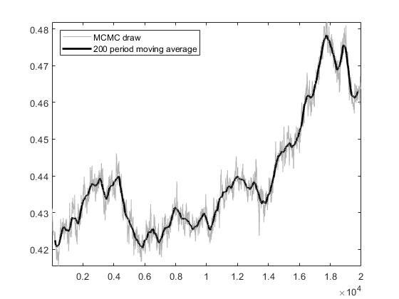
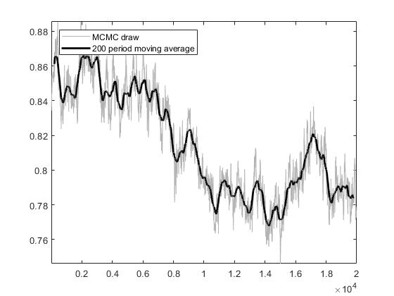
One way to correct this is by updating the prior?