Hi Professor
I am have a bit of trouble plotting data with matlab …
The data is quartely, and starts from 1986Q4 to 2016Q4,
and I want to specify time axis with Matlab…
clear all; close all; clc;
load a1.csv;
k=0;
for i=1986:2016;
if i==1986
quarters=[12];
else
quarters=[3 6 9 12];
end
    for j=quarters
        k=k+1;
        T(k,1)=datenum(i,j,1);
    end
end
plot(T,a1,‘b’,‘LineWidth’,2);
set(gca,‘XTick’,[T(1):365*1:T(end)]);
datetick(‘x’,‘yy’,‘keepticks’);
recessionplot;
ax = gca;
ax.YAxis.Exponent=0;
set(gca,‘FontSize’,14, ‘FontName’,‘Times’);
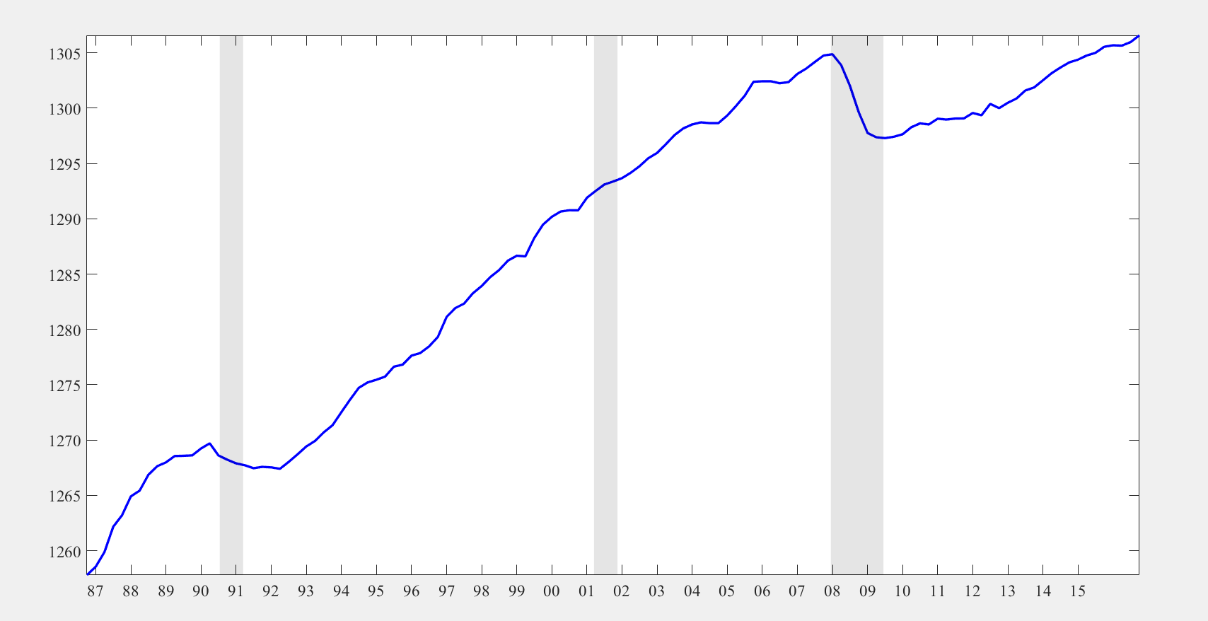
However, when specifying dates as shown below in “test.m”, the plot I got isn’t exactly correct.
From the plot below, it looks like the data starts from somewhere in 86 and ends in 15Q4….
Please could you indicate me the problem??
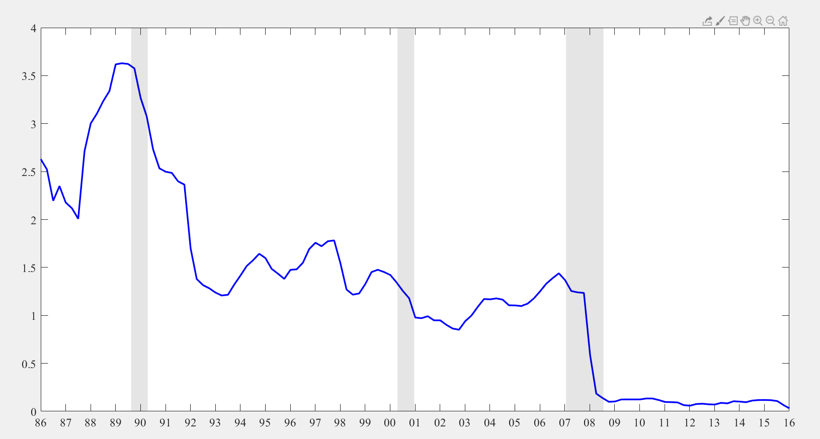
Q2. the “recessionplot” build-in function with Matlab is based on the US data. However, if I want to customize it for the EU data or UK data, how am I suppossed to mofify the “recessionplot” part?
say, if I want to specify the recession for the UK as 2008Q1-2009Q1, how am I supposed to modify my clode?