Hi.
I estimated a model yesterday and I saw some graphs that I have never seen before. They are called “Constant”. I believe they are triggered by the option “smoother” in estimation command. I read some explanation about it in the manual but I could not understand it (and I am not really sure if it refers to this graph). I also believe that it has some relation to the fact that it is a nonlinear model.
Could anyone help me, please?
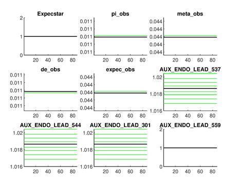
Your data is not demeaned and the estimated parameters affect the mean/steady state of the observables. The graph above shows the posterior distribution of the steady state values.
Thanks for replying, professor.
I tried to define some observed variables as a deviation from their steady state (ss) values and some others as in (log) levels.
I think the problem was that some steady-states values implied by the model were not the same as in data. Anyway, I declared every observed variable as a deviation. Then, all of these graphs are like the “Expecstar” or “pi_obs” in the previous figure.
Can I say that the figure “pi_obs” is not a problem but a approximation error?
Thank you, again.
Yes, looking at the y-axis scaling, these are constant.
Thank you again for your time and consideration, Professor.