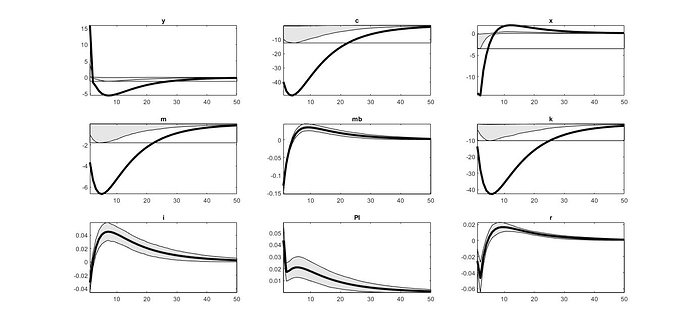
What is the gray shaded areas in the Bayesian IRF plot? I read your article titled “An Introduction to Graphs in Dynare”, but I think there is very little explanation for it. Is there another source for further explanation?
The shaded areas are the Bayesian equivalent to a confidence interval. They tell you in which range the IRFs fall with 90% probability.
in estimation, how can we show the fluctuations of the endogenous variables?
What exactly do you mean with this?
For example, what should I do when I want to investigate the changes and fluctuations of an endogenous variable in DSGE models?
Usually, people look at the IRFs.
Why in the IRF charts,The bold dash is placed outside and sometimes inside the gray shaded areas?
Are you using the most recent Dynare version?
yes. my version is 4.5.6
Then please provide an example of the IRFs in question.
This is one example, can anyone help?
I have never seen something like this. I would need to see the log-files of the run and the files themselves.
