Dear Prof. Pfeifer,
Yes, I generated both plots.
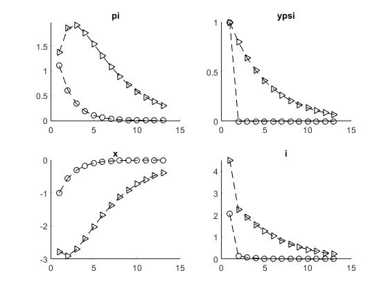
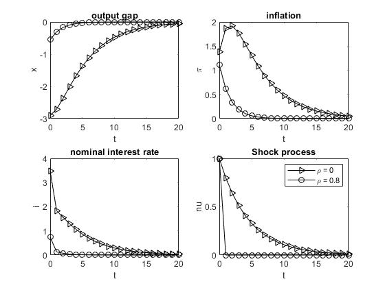
The first plot is the one of my Dynare Code and the second one of my Matlab code for the same model .
The first plot I coded as followed:
figure
for jj=1:length(var)
subplot(1,2,jj)
eval(‘irf1.’ var{1,jj},ending_cell{1,ii}]);
eval(‘irf2.’ var{1,jj},ending_cell{1,ii}]);
hold on
plot(HOR,[eval([‘irf1.’ var{1,jj},ending_cell{1,ii}])],‘LineWidth’,1,‘-k’,HOR,[eval([‘irf2.’ var{1,jj},ending_cell{1,ii}])],‘LineWidth’,1,‘–r’)
title([var{1,jj}] )
end
I generated the second plot with the follwing code
lineStyle = {‘k->’, ‘k-o’};
subplot(2,2,1); hold on;
plot(t, x_solution(t+2), lineStyle{n}, ‘LineWidth’,0.5)
xlabel(’ t ‘); ylabel (’ x ‘); title(’ output gap ‘)
set(gca,‘XTickLabel’,{‘0’,‘5’,‘10’,‘15’,‘20’})
box on
subplot(2,2,2); hold on;
plot(t, w_solution(2,t+2),lineStyle{n}, ‘LineWidth’,0.5)
xlabel(’ t ‘); ylabel(’ \pi ‘); title(‘inflation’)
set(gca,‘XTickLabel’,{‘0’,‘5’,‘10’,‘15’,‘20’})
box on
subplot(2,2,3); hold on;
plot(t, i_solution(t+2),lineStyle{n},‘Linewidth’,0.5)
xlabel(‘t’); ylabel(‘i’); title(‘nominal interest rate’)
set(gca,‘XTickLabel’,{‘0’,‘5’,‘10’,‘15’,‘20’})
box on
subplot(2,2,4); hold on;
plot(t, w_solution(1,t+1),lineStyle{n},‘Linewidth’,0.5)
xlabel(‘t’); ylabel(‘nu’); title(‘Shock process’)
set(gca,‘XTickLabel’,{‘0’,‘5’,‘10’,‘15’,‘20’})
legend(’\rho = 0’,‘\rho = 0.8’)
box on
If you compare both the second plot looks much better. I do not like the first plot not to start from the axis. I want to have this legend as in the subplot shock process. And the second plot is in a square. Now I want to find a way to generate the first exactyl as the second plot.
Can I include this part for e.g
" xlabel(’ t ‘); ylabel(’ \pi '); title(‘inflation’)
in my dynare code? or how can I improve the look of the first plot?