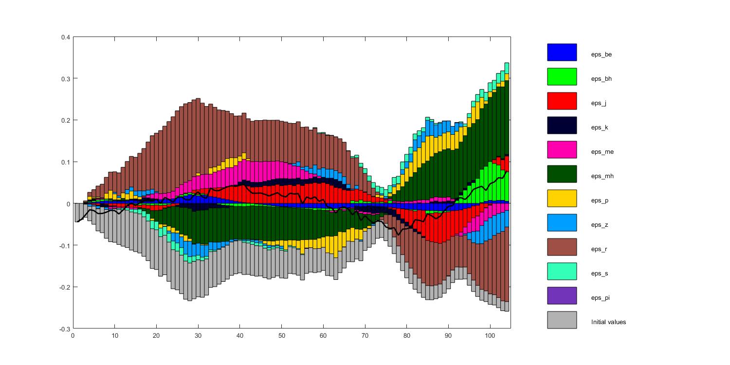
I would really appreciate your help with one of my shock decomposition graphs. To me it looks a little bit odd, as most of the shock contributions change their sign towards the last third of the sample (when the smoothed series starts to increase again). Like some sort of overshooting behaviour. Hence, it would great if I could get a second view on this, as the graph might indicate fundamental problems of the model/data/estimation.
Thanks a lot Johannes, at the moment I have just looked at this and another observable. The latter looks absolutely fine. I’ve estimated the model on 10 observables, I will check the other decompositions too in order to rule out any fundamental problems.