Hi,
Can anyone please tell me how to produce a graph (
) like this one after the Bayesian estimation of the DSGE models?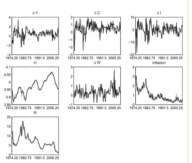
This plots the actual data well as the one-period-ahead forecasts obtained from the Kalman filter.
Thank you
Sahil
Hi,
Can anyone please tell me how to produce a graph (
) like this one after the Bayesian estimation of the DSGE models?Thank you
Sahil
Hi sahil,
I’m afraid Dynare does not have a specific command to trigger a comparison chart of observed and filtered (one-step ahead) variables. But this can be easily implemented manually. To get the filtered variables, do the following:
filtered_vars in the estimation command.oo_.FilteredVariables.smoother option, which triggers the computation of the posterior distribution of smoothed and updated variables and shocks.For further help, please take a look at the reference manual: https://www.dynare.org/manual and search for estimation.
Hope this helps.
Hi Tavinho,
Thank you for your reply. This helped.
Best
Sahil